I can't remember a time where the games were this unpleasant aesthetically. Now of course this isn't all the teams, many traditional franchises have carried into the Nike-ification quite nicely. Chicago, Pitt, KC, NYJ, Oakland, GB...the usual suspects still look great. But some of these other franchises have just flown off the handle into the depths of idiocy. I never thought I'd see so much neon on a football field. The Jaguars helmets and general look. The Falcons and their bush league mish mash. The Bucs, the Seahawks. The Cardinals were a huge tragedy. Plus silly monochrome looks that the Ravens and Saints bust out (enough of the black on black)
And then you have the awful strange neckline and discolored sweat boxes. Make the jersey look like a skintight bumpy patchwork mess
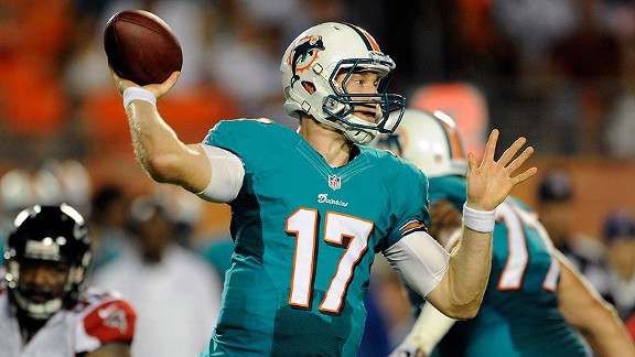
Now I realize a lot of this is function. Of course players want to wear tighter jerseys which gives the opposition less of a chance to grab them by the jersey to hold or slow them down. That's all well and good but it just looks terrible. I can't stand seeing Larry Fitzgerald in his spandex tanktop

when I'd much rather be looking at something like this
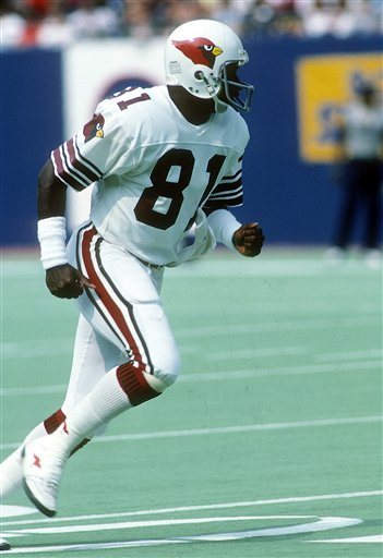
Imagine that. Enough room on the sleeve for non truncated stripes AND a Cardinal bird.